
How to Keep Big Shapes Interesting
Small shapes often get the love but Mark Mehaffey (Ep.5) knows that big shapes have some important roles in your painting’s success.
And the good news, these aren’t tricky to implement in your next painting.

First, big shapes help with size contrast. Your little shapes will be more interesting if there are large shapes to contrast with them.
Second, big shapes also help you understand relative sizes. If you have a large building, it helps you understand the size of people and cars.
And third, from a more practical standpoint, big shapes are great places for your viewer’s eyes to rest.
Even knowing this, sometimes the challenge eof big shapes is how to keep their shape intact while also making them interesting (but not *too* interesting.)
Mehaffey says the answer is contrast. But whereas normally we think of contrast as the thing that pulls our eye to a focal area, that’s only part of what contrast, namely high contrast, can do.
Big shapes are where you get to take advantage of low contrast.
Put it to Practice:
Contrast is how different two things are. Black next to white is high contrast. A mid tone gray next to a slightly lighter mid tone gray is low contrast.
And this is an important concept to understand especially when working with big shapes.
You want to keep the shape, meaning you’ll want to make sure that your contrasts aren’t TOO dramatic within the shape. That will actually break up the shape into smaller shapes accidentally.
Try to create small amounts of contrast. You can do that through value, color, temperature, saturation or texture.
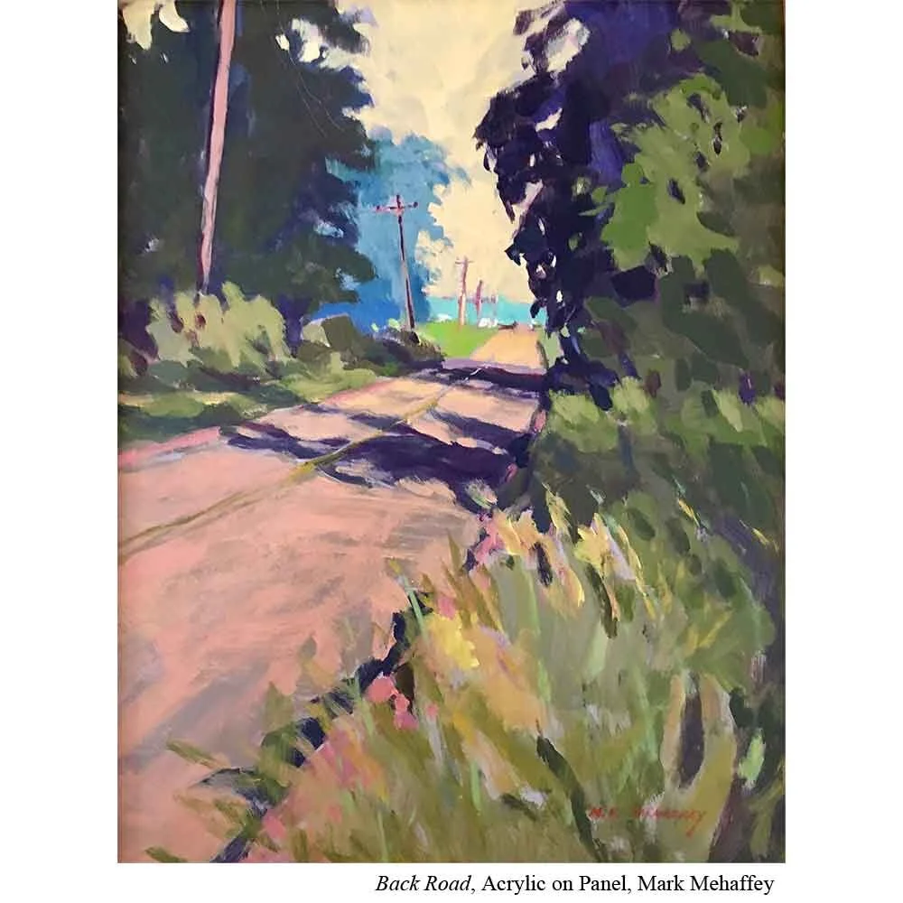
After all, just because something is a single shape doesn’t mean it needs to be a single color.
For example, if you have a large green field, you don’t necessarily need to do a uniform flat wash of green.
You could make the greens in the distance slightly cooler and the greens in the foreground slightly warmer even while you keep the values more or less the same.
Even just the ability to see brushstrokes within the color creates a little contrast to delight the eye.
Or you could, as Mehaffey suggests, slightly vary the temperature or hue from one side of the large shape to the other. By slowly transitioning the temperature or hue you are also making sure to keep the shape itself in tact. No hard edges to break it up visually.