How to Build Your Workhorse Colors
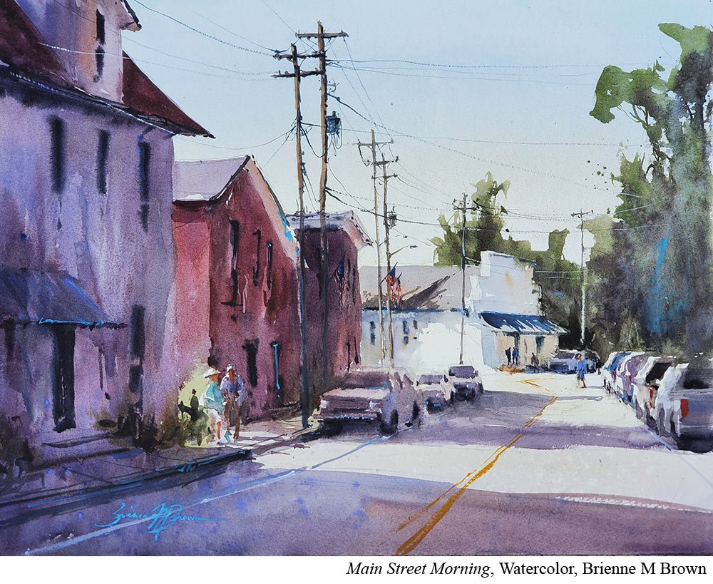
Brienne M Brown (Ep.46) has a clear strategy when it comes to the colors on her palette.
She has what she calls her stock colors (transparent yellow oxide, quinacridone rose, and cobalt blue). These are her workhorse colors and show up in basically every painting.
She then adds pigments that will help her mix dark, rich colors.
Finally she has a few true opaques which she’ll use very selectively to add sparkle and interest.
Put it to Practice:
Your pigments have jobs. Not just “paint a pretty painting jobs” but specific jobs within your paintings. Do you know what they are?
Because if you have 30 pigments you pull out every time, it’s very possible you have bottles and tubes that aren’t necessary. They are just getting in the way, and they make it harder to paint.
Here’s how you can take stock.
Pull out your pigments and put them in color families Blue, green, yellow, etc). First look for duplicates. Do you have two cadmium reds you pull out each time accidentally? Put one away.
Then look at the warm and cools of each color. You really only need a pigment in its warm version and it’s cool version. So if you have a cadmium red and a pyrrole red, those are both warm. Kick one back into the cupboard.
Do this for each of the color families.
If you want to try a more paired down version, aim for 6 colors including a warm and cool of each of the primaries (yellow, red, blue) and then try and mix your secondaries (orange, purple, green.)
Then add a pigment or two back in for some sparkle. Add back a white (unless you’re watercolor) and maybe something to help you mix darks.
And now you have a mean, lean palette machine and hopefully fewer bottles and tubes clogging up precious real estate.
Try this for a few weeks to see how you feel. Remember, you can always add colors back in but it’s worth trying for some amount of time to see if it could be a good fit.


