Organizing Your Palette Beyond Warm and Cool
We often talk about the limited palette on the show. Often guests set up their palette using a warm and cool of each primary (red, yellow, blue).
When they arrange their colors on their palette, they let their colors guide them, arranging the colors like a color wheel.
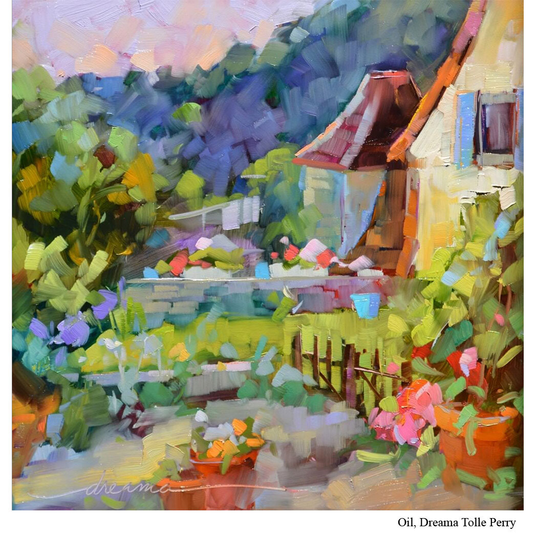
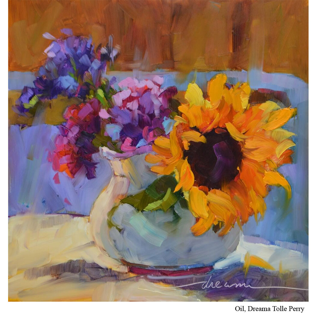
But Dreama Tolle Perry (Ep.18) uses a more expanded palette of 14 colors plus white. And when it comes to how she arranges them, she takes a slightly different approach than the norm.
Perry doesn’t arrange her colors all in a single color wheel.
Instead, she divided her pigments up first by their level of transparency, grouping all the cads in one area and all the transparent colors in another.
She lays them out in the same place every time. But by distinguishing them out by transparency, this helps her know exactly what she’s mixing when it comes to transparency...and that dance between transparency and opacity is one of the ways that her work can visually sparkle.
Put it to Practice:
Color has four characteristics, one of which is transparency.
Pigments come straight out of the tube with an innate transparency characteristic. Some are opaque (like the cads you’ll find on Perry’s palette), transparent (the quinacridones), or somewhere in between.
A color’s opacity will affect several things including how much it covers the pigment below it, how it mixes with other colors, and how it responds when you mix in white.
The good news is you don’t necessarily need to know all the ins and outs of transparent pigments to get good with color. But it is useful to begin learning which of your pigments are what level of opaque or transparent. Information you can find directly on their tube or bottle.
And you may find that when you separate them out on your palette like Perry does, it helps you use them more effectively in your work.


