
How to Understand Value and Why it Matters
In Ep. 36 with Ian Roberts, we talk a lot about composition.
In order to understand composition, first you need to understand value and its role in painting.
WHAT IS VALUE?
Color has three properties: value, hue, and saturation (also called intensity).
Hue is the color (yellow, orange, red, etc.) Intensity is how much saturation is in it and is on a continuum between a color’s most saturated and it’s most neutralized grey. Value is how light or dark a color is.

The easiest way to see value is to do what’s called desaturating an image. You can do this in your phone’s editing app or in something like Photoshop.

On the left is the photo in full color. On the right, the photo has been desaturated in photoshop so that all you see are the values. Nothing else has been changed.
Understanding value is one of the most important factors in beginning to understand what makes a strong composition. This is because while we love color, a strong structure is all about value. Color is important but color is the icing...value is the structural cake.
LEARNING TO SEE VALUE IN PAINT
To learn to see value, you have to learn to see past color. This isn’t something you are born able to do. Artists learn to do this.
When you squeeze color out of a tube of paint it has a value. When you add white, you will lighten it’s value. When you add black, you will darken it.
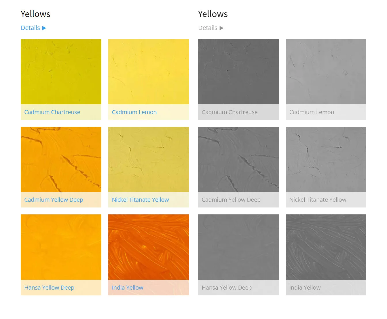
Left: Tube paint options from Gamblin Paints (gamblincolors.com). Right: Those same colors desaturated.
In fact, unless Color A mixes with a Color B that is exactly the same value, almost all color mixtures change the original value a bit. If you want to lighten your red, for example, you can use white or a lighter yellow.
If you are working in a transparent medium like watercolor, you can also lighten your value by adding water to it.
SIMPLIFYING VALUES
Just as your tubes of paint have value, your subjects (either a reference photo or real life) have values as well.
It will take some practice to learn to see values, but you can also use tools to aid you. As mentioned above, you can desaturate images with apps. You can also squint your eyes to see values more clearly.
But seeing values is only part of the battle.
Your reference will have dozens if not hundreds of subtle value shifts. Unless your goal is to paint photorealism, your job is to begin to simplify these down.

This photo has been desaturated so that you only see the values, not the hue.
You will simplify on two fronts:
First you will simplify the number of values you’re planning to paint. This means making some of the original values slightly lighter and others slightly darker to fit, for example, five values.
This is just for the plan. When you translate these back to color, they may adjust a little but the goal here is to simplify down into just a few values.
Second you will simplify the number of total value shapes. The image below only uses 5 values but is still made of thousands of shapes.

This image has been manipulated to be only five values…but look at all those shapes! That’s too many shapes.
While there is no rule for how many shapes you’re aiming for, see where you can combine similar values to make one value.
Below I’ve turned all those values into 5 values and 11 shapes.
Simplifying values goes hand in hand with simplifying shapes.

This isn’t how the final painting will look of course. This is a simplification. But this simplification puts you on the path for a strong composition.
HOW TO PRACTICE SIMPLIFYING VALUES AND SHAPES
This simplifying values and shapes isn’t intuitive. So much so in fact, most the representational guests on the show have created special places in their process to do this discovery work. This is not something they (or you) figure out in the main painting itself.
This is where artists turn to thumbnails, small drawings (under 3” wide or tall) that they use to audition simplified versions of their values and their shapes.
Even seasoned artists will try many different versions of the same subject as they look for the best value plan (also called a value pattern) to make the best painting.
NEXT STEPS
Now that you’ve translated your subject into a value pattern, it’s time to go back into color. Remember, that Gamblin Paints photo from above. All colors have value and so you’ll begin looking for colors that match the value plan.

The only difference between the top greens and the bottom greens is desaturation. (From GamblinPaints.com)
Learning to see value, to create value patterns, and then to translate that plan back into color are not simple steps. But they are critical in creating paintings with strong compositions.
As you develop these skills, don’t give up. You are learning to see as an artist and you are taking your first and very important steps toward creating eye-catching, compositionally powerful paintings.
Get more ideas on how to get better at painting by joining the Learn to Paint Podcast newsletter! Add your name and email below.