
How to Take Advantage of Value with Sarah Sedwick
Value is your painting super power…especially if you take advantage of the tools and ideas to use it effectively.
Sarah Sedwick (Ep.60) shows you how.

#1: PREPARATORY TOOLS
Tools are just that, tools. As an artist, you have tools like paint and paper and brushes. You also have thinking tools like thumbnail studies and value sketches.
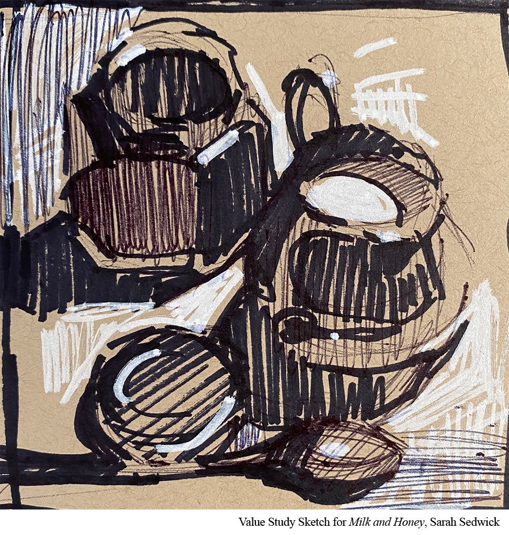
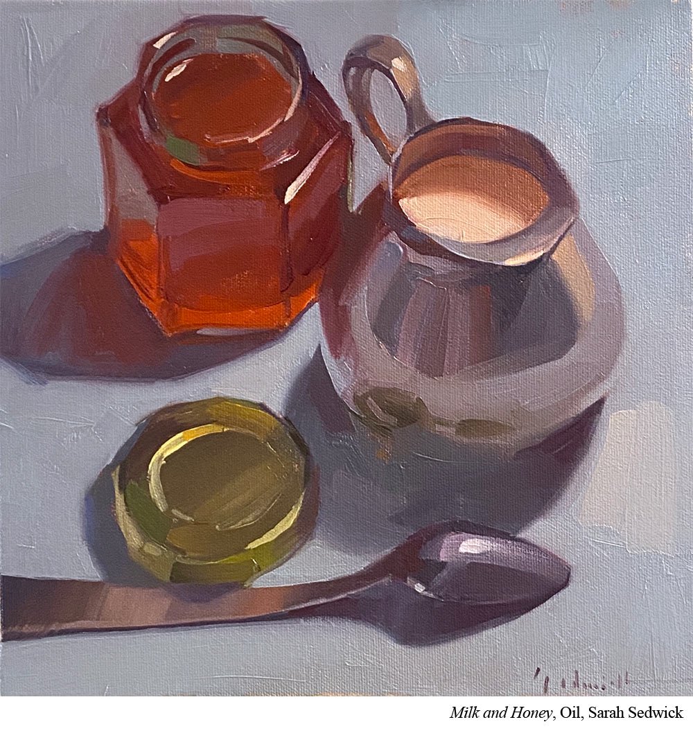
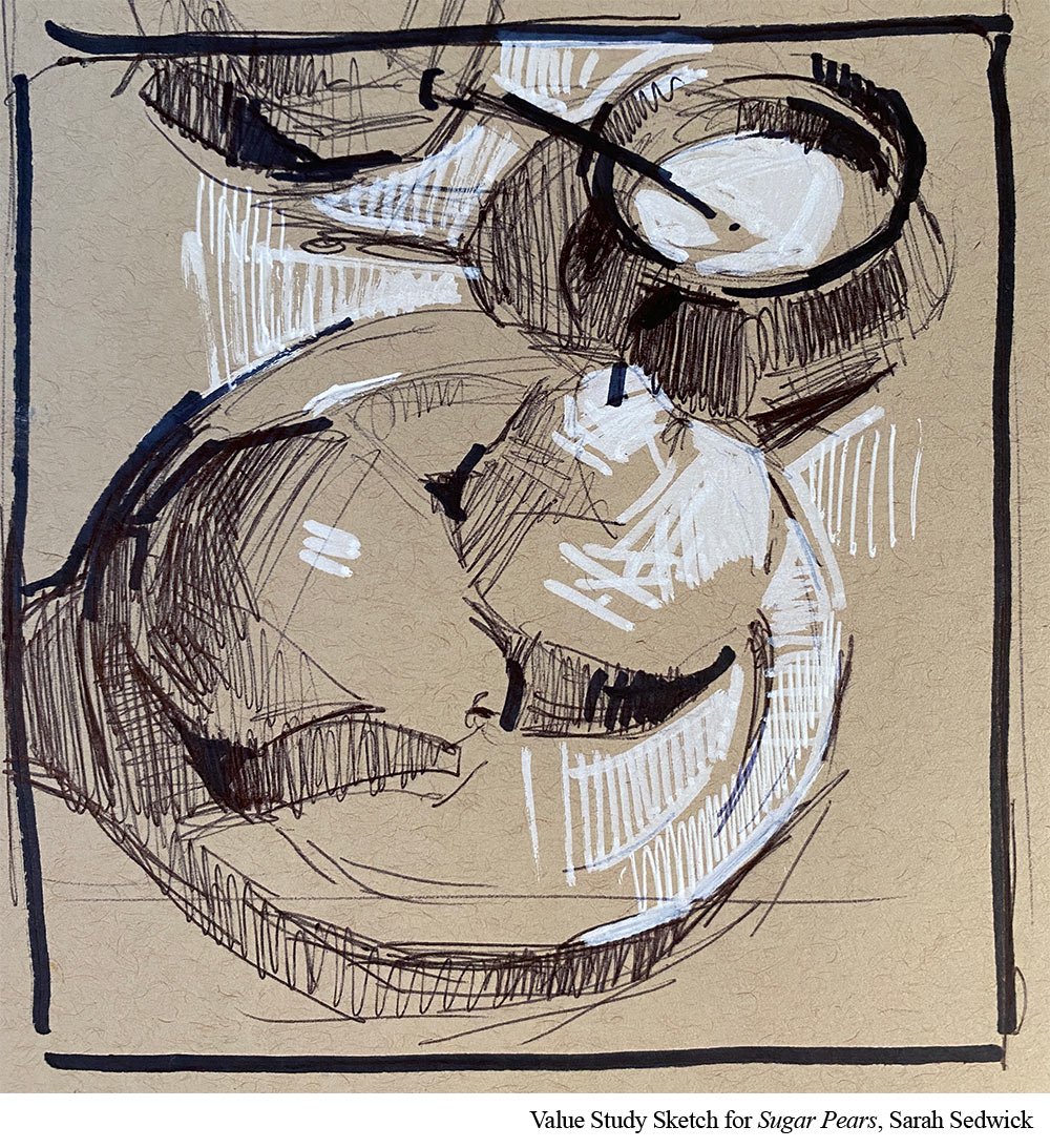
Sedwick uses two primary tools when planning her values. These include both her3-value sketch and her 5-value painting study. (We talk about both in depth in Ep. 60.) She doesn’t use these for every painting she creates. But they are tools she has access to for when she needs them.
When you begin painting, it can feel like those preparatory tools are the green beans your parents make you eat before you can have dessert. They can feel almost like punishment.
But the right tool at the right place can make everything else after it more fun. Just like finding the right brush can make all the difference or adding a new blue opens up a world of purples previously unknown.
Put it to Practice:
If you haven’t tried preparatory tools, toss them in occasionally to see how you feel about them. If you love how you work and end each painting loving what you create, skip them.
But if you find yourself frustrated with your work and you can’t quite figure out where things are going sideways, this is where preparatory tools will make a big difference.
A word of caution: These tools look simple. But if you’ve never practiced thinking about value in your painting, there will be a learning curve. Be patient with yourself as you develop this new skill set. It takes a little time to get comfortable understanding how they work.
#2: RANGE
The world comes as bright as the sun and as dark as zero light.
But for painting, there is no color as bright as the sun or as dark as the darkest dark. As artists we have a much more limited range of light and dark. We have a scale that runs from carbon black to titanium white. This means that all the lights and darks of our painting need to fit within that range.
It’s an obvious idea but putting that idea into painting practice isn’t as intuitive as it seems at first glance.
This is front and center though in Sedwick’s mind. This is a knowledge around which she actively plans her painting. If she knows titanium white is as light as she can go. And she knows that that’s going to be her highlight, she has to build her painting around that. Even something that is very light needs to be dark enough so that it doesn’t compete with that titanium white highlight.
This means that things that seem very light in her reference may need to be knocked back to slightly darker in paint so that that highlight can still sing.
Put it to Practice:
Before your next painting, write down where your lightest light is and your darkest dark is. Make sure you know where they are in a written form because in the heart of painting, it’s so easy to forget that vital information. And now that you know them, double check all your other color (and value) choices against them. If you mix a color that’s light but it’s too close to your lightest light, you might need to darken it a bit so that your lights can still sparkle.
#3: CONTRAST
The human eye loves high contrast. It especially loves high value contrast. People will always look at the places in a painting where value contrast is the highest. Sedwick uses this to to create focal areas in her work.
This is also part of her painting’s value hierarchy (and where she brings in those value tools from Takeaway #1.)
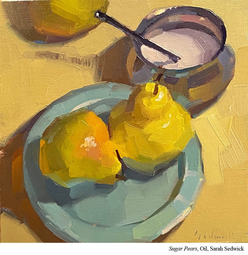
She plans her painting so that her highest value contrast is at her focal area. That means her lightest light is next to her darkest dark. (Takeaway #2.)
She then makes sure she doesn't have that level of value contrast anywhere else in her painting. She will have lower levels of value contrast other places, but she makes sure to keep the HIGHEST level of value contrast at her focal area.
Put it to Practice:
When you look at your reference, where do you want people to look? What is the star of the show? Once you know that (and it never hurts to write it down), try to get a first draft on paper through a value study.
Design your value study so that that star has your painting’s highest value contrast. Then design everything else so that it has lower value contrasts. It’ll feel like putting the pieces of a puzzle together.
If you run into trouble, just try again. This is why it’s so great to work out this puzzle on cheap copy paper or in a sketchbook and not in a full painting. You can easily shift things around and not feel like you’re messing up anything important.
THE POWER OF VALUE
Value is the workhorse of painting in color. Take advantage of the tools and concepts that you have available to you (and that take under 5 minutes) and your paintings will be stronger for it.
Get articles like this and new podcast episodes sent straight to your inbox by signing up for the newsletter below.