
How to Create Rest Areas in Your Paintings (and Why It Matters)
Have you ever walked into a loud space where voices shout to each other across the room? It’s impossible to tell where you should place your attention because everything is calling to you at the same volume.
Carolyn Lord (Ep.21) knows the same thing happens when you’re looking at a painting. If every area of a painting is calling for your attention, as a viewer, you don’t know where to go.
This is why artists like Lord create a hierarchy of interest.
A hierarchy of interest will include a focal area or an area of interest. And you may be most familiar with those.
But a hierarchy also must include something else: Areas of rest.
Here’s why they matter and how Lord creates them.

Areas of rest have two jobs.
First, they help a painting to be more interesting through contrast.
If every area says at full blast, “Look at me,” that can be less interesting than a piece where you’ve designed places for the viewer to find quiet. Having both loud areas and quiet areas creates contrast and actually lends energy to those high energy areas of your painting.
Second, it does what the name implies. Rest areas give the viewers places to pass over at first glance and then maybe return to later. It gives the viewers a place, in Lord’s paintings, to take a breath before jumping back into the fascinating shapes that make up her work. It means they will spend longer looking at your work overall.
Here are three ways Carolyn Lord designs areas of rest in her paintings:
1. Neutralized color
2. Repetition of shapes
3. Low value contrasts
NEUTRALIZED COLOR
The first way Lord creates areas of rest in her paintings is by using neutralized color. Neutralized color is color that has been greyed down often through the addition of a color’s complement. In watercolor you can also lessen a color’s intensity through adding more water.
For example, if you add a green to an red, as its complement, it knocks the intensity of the red down. If you add a lot of green, you’ll get to a point where the red turns grey. The red is now a neutral.

The poppies in the foreground are a highly saturated red orange next to a highly saturated blue green. The oranges and the greens both become less saturated in the calmer section below the tree.
In Lord’s work, she may use a highly saturated green next to a highly saturated red in an area of interest. This will demand the viewer’s attention. But Lord will then gently neutralize those same colors in the areas she doesn’t want to be as active. This creates a calmer color dynamic in which the viewer can visually rest.
REPETITION
A second way Lord creates areas of rest in her paintings is through repetition of shapes.
Think of a single circle in the middle of a page. It draws your eye. Or if you have a single circle in a sea of squares. Again, that circle draws your eye.
But if you have a page full of circles (think wrapping paper) suddenly your eyes say, “Another circle. I’ve seen one, I’ve seen them all.” It notes the repetition and then looks for something more interesting elsewhere.
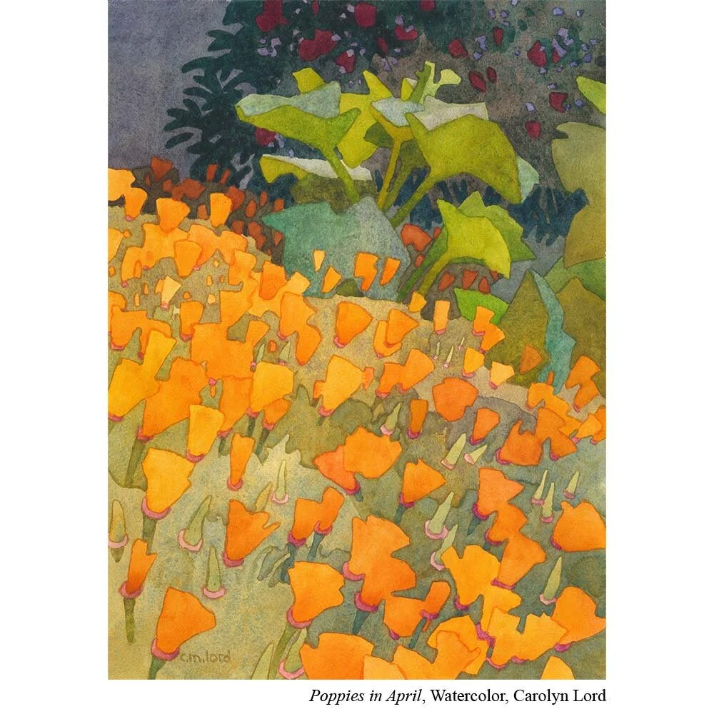
These poppies all share a similar shape and so the eye moves across them more easily than if they were next to additional flower shapes.
Lord uses to her advantage. She creates an area with dynamic shapes but creates repetition within those shapes. She creates enough repetition that the eye passes over it to an area with higher shape contrast.
VALUE
Value is probably the biggest way Lord creates resting areas for her viewers.
If you took out all the color in a photograph (or desaturated it), what you are left with is a grey scale of black to white. That is value.

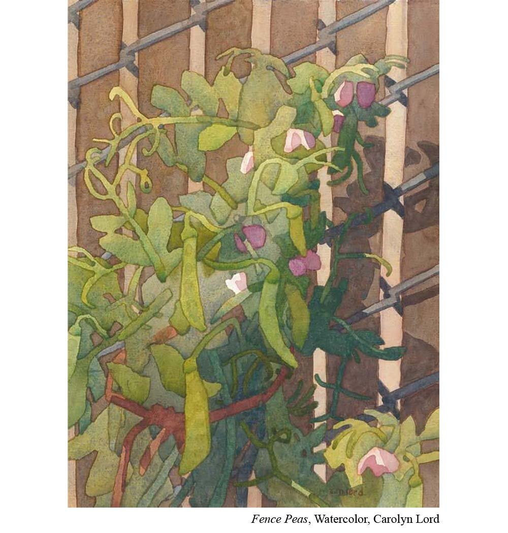
The greens of the leaves and stems are so similar in value that the eye can rest easily for moment.
While our eyes love color, our brains register value contrast much more strongly. That’s why an artist can create an area of interest by putting her lightest light next to her darkest dark. It’s that value contrast that pulls our attention.
But on the flip side of that, Lord knows that if she creates areas in her work with low value contrast, she can create resting areas. She can even play with color in these areas as long as the value itself isn’t high contrast.
PUT IT TO PRACTICE:
Even if you don’t paint like Carolyn Lord, you can still use these principles in your own work. After you’ve decided where you want your focal area, think about how to create areas of rest in the other areas of your painting.
For example, if you're a landscape painter and your focal areas include a red barn with a black and white cow next to it.
Now that you know your focal area, you could use black and white spots on your focal point cow, but then use grey spots (instead of black and white) on the other cows. This will create value contrast.
Or, if there are trees nearby (but not in the focal area) you could use more highly saturated greens closer to your focal area but neutralize those same greens as you move away from your focal area.
If you’re an abstract painter these same principles apply. Ask yourself, where do you want your viewers to look first? Have that be where you use your highest value contrast and color contrast and then choose other areas of your piece to have more repetition of shape or neutralized colors.
AVOIDING BUSY
The line between energetic and busy is a delicate one. But one of the secrets to staying on the right side of it is by designing in areas of rest. That way viewers can enjoy the energy of your painting, have a visual rest when they need it, before jumping back into the excitement.
Get articles like this and new podcast episodes sent straight to your inbox by signing up for the newsletter below.