Design Stunning Paintings with Reference Photos
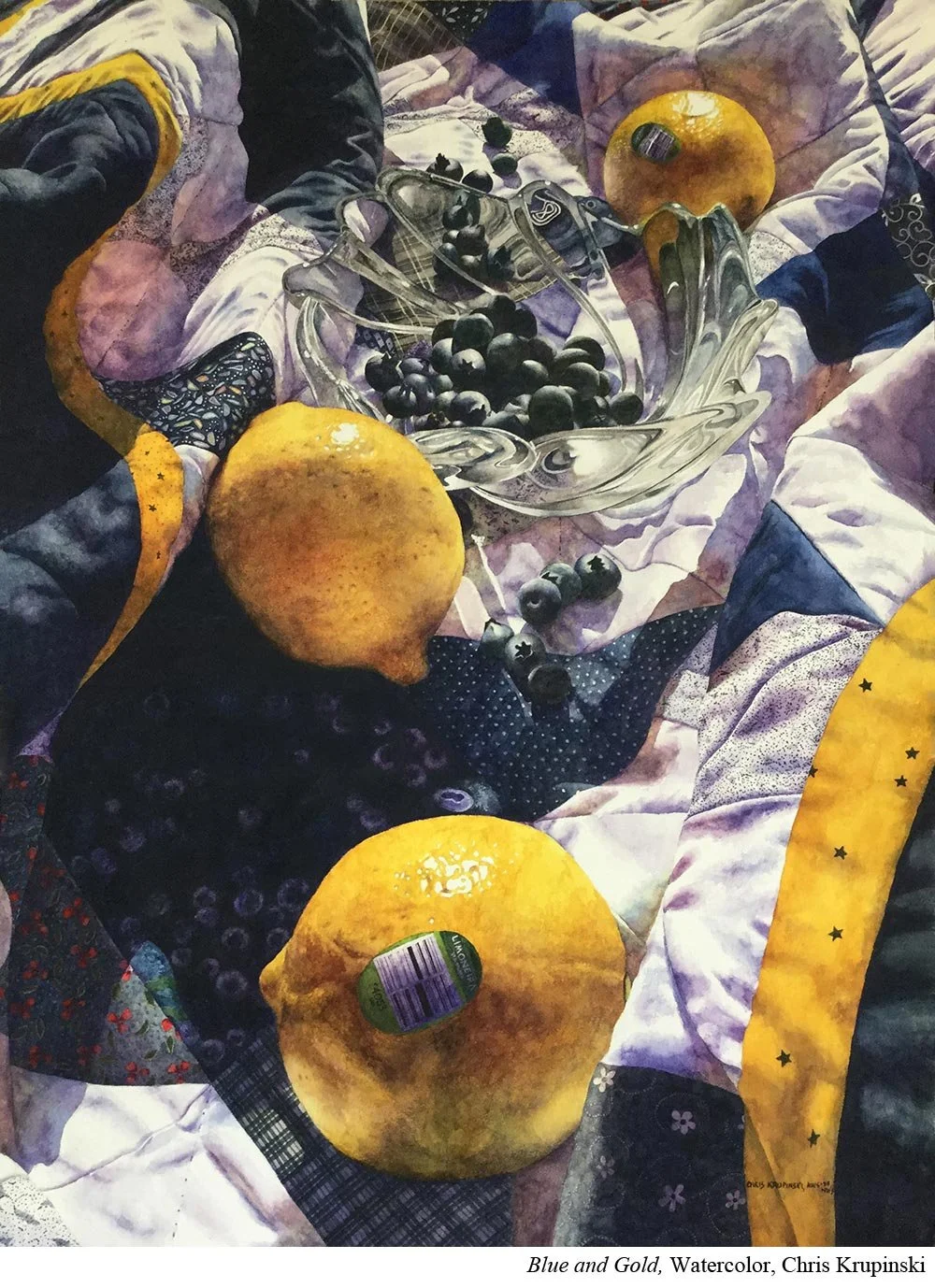
Watercolorist Chris Krupinski (Ep.2) couldn’t create her award-winning design without one essential tool: reference photos.
Krupinski skips thumbnail sketches all together and prefers to do that thinking and planning work during the photography portion of her process.
Put it to Practice:
Here’s how Krupinski ensures you get great design in your reference photos.
First, use the rule of thirds. This means divide your photograph up in three equal spaces both horizontal and vertically. Place your area of interest in one of the four places those lines overlap.
Next, make sure the objects in your painting vary in size and shape. That you have some repetition but also variation.
Additionally, use triangle shapes to move your eyes around your page. For example, if you have a group of cherries, make sure you have three areas in your painting where you have a cherry or cherries. That triangle will create a much more dynamic painting.
Finally, make sure you have areas of rest in your painting. Krupinski uses large pieces of fruit for just that.
If this all sounds complex, it is. And that’s exactly why Krupinski likes to take advantage of photography to help her figure it out.

