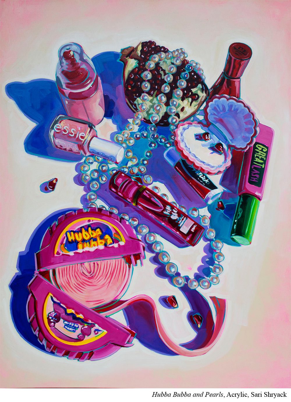
Colorful Paintings Start Here with Sari Shryack
Artist Sari Shryack (Ep.40) wants her work to be super colorful. And that effort begins with the tube colors she chooses to be on her palette.
Shryack fills her palette with high chroma pigments.
Her palette colors include: titanium white, cadmium yellow light, cadmium yellow medium, yellow ochre, cadmium red, pyrrole orange, alizarin crimson, quinacridone magenta, dioxazine purple, ultramarine blue, phthalo blue, phthalo green and then either hooker’s green or jenkins green.
Next, but almost more importantly, she deeply understands how color WORKS. She knows she can’t just go into a painting slapping down the brightest colors she sees. That would create visual chaos.
Instead she works up to her colors. She knows what she wants to be bright and then she lays the groundwork for that later color.
For example, she will work through a painting in several different passes bringing up the entire thing together. (That way she can stop at any time and have it feel equally finished across the whole piece.)
She starts with muted darks and builds up her shapes both in value (working darker to lighter) and saturation (working less saturated to more saturated.)
This means that by the time she lays in a highly pigmented color, the painting can support it.
Put it to Practice:
If you want bright and colorful paintings, there are a few skills you’ll want to build and then use in tandem.
First, make sure that the pigments you are starting with can make bright colors. Not all reds and blues create saturated purples. Not all yellows and blues make saturated greens. So swatch your colors and just confirm that you have the baseline materials to actually mix high chroma secondary and tertiary colors.
Next, look at your finished paintings and analyze your contrasts. Do you have value contrasts that will help your color sparkle? Are you putting in enough muted colors so that the high chroma colors can really sing?
And then finally, if the answer to the last question was no, think through your process. Design it so you can intentionally build in those contrasts to how you build a painting.


