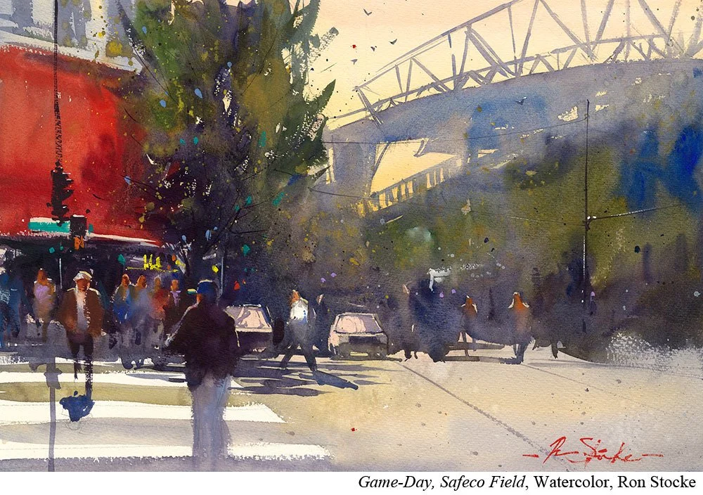
A Simple Way to Create Visual Pop with Ron Stocke
Ron Stocke’s (Ep.78) palette has 35 wells and most of them are filled. But that doesn’t mean they all have the same job.
In fact, some of those colors will rarely find themselves on his mixing palette. He keeps them for one job only.
Accent colors.
Accent colors are what the artist turns to when he needs a pop of color, something to create a little sparkle or move the eye.
And that’s what they remain.
He’s not using them as workhorse colors or adding them to mixes to create color harmony. They are a secret weapon to use sparingly and with purpose.
Put it to Practice:
Take a look at the subjects you paint. Would it be useful to have a few accent colors on your palette?
When working with accent colors, it’s important to keep them as accents. A dot here, a line there. Their power is in their limited use.
If you do want to use them more aggressively in your painting, you’ll want to mix them into some of your other pigments in earlier stages so that you’ve created some color harmony.
If you’re using your accent turquoise but haven’t mixed it into any of your other colors and then you fill an umbrella with it, that will stick out and seem separate from everything else in the painting.
So declare it an accent color and use it as such. It’s a great way to add some unexpected sparkle to your work.

